Happy Monday folks! In anticipation of the Lynnderella sale about to take over on Llarowe this February, I decided to use my Lynnderella polishes again. If I'm stalking the fabulous land of Llarowe, I might as well use what I have for now to hold me over, right? lol.
What I imagined in my head, did not turn out as anticipated. This layering combination did not turn out as pretty as planned. I had high hopes for this, but it fell flat. Very, very flat. I wasted two fantastic coats of Connect the Dots and a perfectly good manicure of Dragontini :::weep:::
I started off with two coats of Duri Dragontini, which is a purple creme with red undertones. I don't want to call it medium, and I don't want to call it dark. The purple is somewhere in the middle. (If this were a box of hair color it would be called medium dark purple lol) Formula was easy to work with, and I used two coats for the photos shown. I had a little bit of cuticle drag on some nails and could have used a third coat, but I would like to blame that on my rushing.
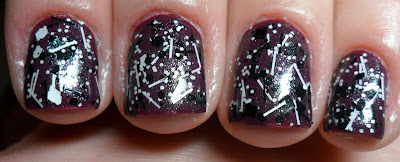
I then added two coats of Lynnderella Connect the Dots and a coat of Seche Vite to top everything off. I ended up with this.....
Not so fabulous, huh? I almost didn't want to post this manicure, but I figured this may save someone else time and perfectly good polish. The shimmer in the base of Connect the Dots made Dragontini looks almost brown. It's neither polishes fault, just bad layering on my part. Connect the Dots looks FABULOUS over bright and neon cremes. I don't think I will be layering this over a dark color again. The black glitter doesn't 'pop' like I like it to. If I'm going to layer Dragontini, maybe next time I'll do it with something along the lines of China Glaze's Techno or Fairy Dust.
What do you think? Am I my own worst critic or is this a dud manicure?
Also, I obviously changed the background and text colors for this blog. What do you think? I like the fact that it's easier to read the text and the photos stand out, but is the background itself too much?
As always, thanks for stopping by <3


No comments:
Post a Comment